What’s New? What’s Old?

“Is this part of the original house?” is one of the questions people ask when they visit Midori Haus.  We feel complimented when people ask that question because we did put fair amount of effort into re-using materials to give it the look and feel of a vintage house that was originally built in 1922.  When we didn’t have any specific old looking items to re-use we bought new items that were made to look in the old style.

An example of this is the push button switch for the lights.  The house did not have push button switches when we bought it in 2010 but we are pretty sure that the orignal house did.  So to give it the original look we bought push button switches and switch plates in oil-rubbed bronze finish from Rejuvenation in Berkeley.

Most are simple on/off switches where you press the top button to turn lights on.  To turn the lights off you press the bottom button.  Some of the switches have a dimming function where you press the bottom button for on/off and the top is an adjustable dial to control the light intensity.  We chose to use these antique looking switches for pure decorative purposes.  There are no energy efficiency advantages.

Let’s look at the hallway bathroom door for a good mixture of old and new items.  The frosted glass on white door with the glass door knob has a vintage look.  When friends saw this door before the renovation they would say, “That looks like the door in my grandmother’s old house,” or “My basement door in my old bungalow has a door just like that.”

 We added the stained glass window above the door to let more light into the hallway.  People often perceive this to old but we got this new from The Bright Spot.

The door, the knob and the trims are original with fresh paint.

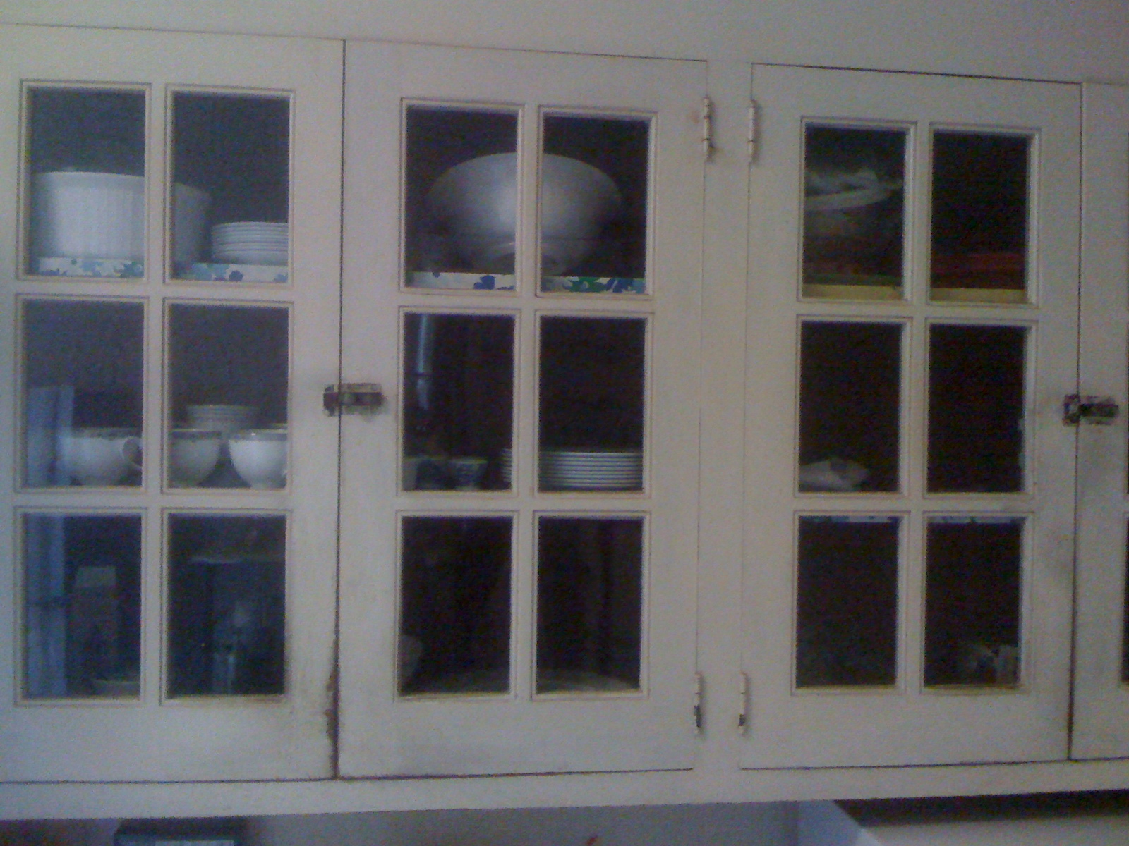
 We kept the built-in storage unit in the hallway.  These front got some fresh paint and the inside was simply cleaned.  It smells of old wood when you open the drawers and it’s part of the charm.

Most of the floor is original.  We removed the floor coverings (tile, carpet, linoleum) and had the original wood floors refinished.

The windows on the front of the house retained the same positions and size.  The triple-pane, Argon-filled fiberglass windows have a much better performance than the old single pane leaded window.

We did re-use the trims around the windows.  Santa Cruz Green Builders did a great job of matching the wood covering the deep window sill with the original window trims.

Notice the patched marks of nail holes on the window trim.  This is evidence of prior homeowners  installing curtain rods multiple times on this window trim.


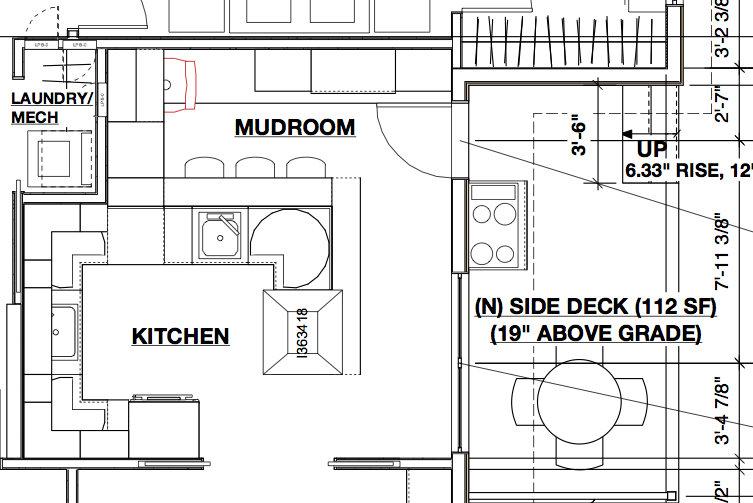
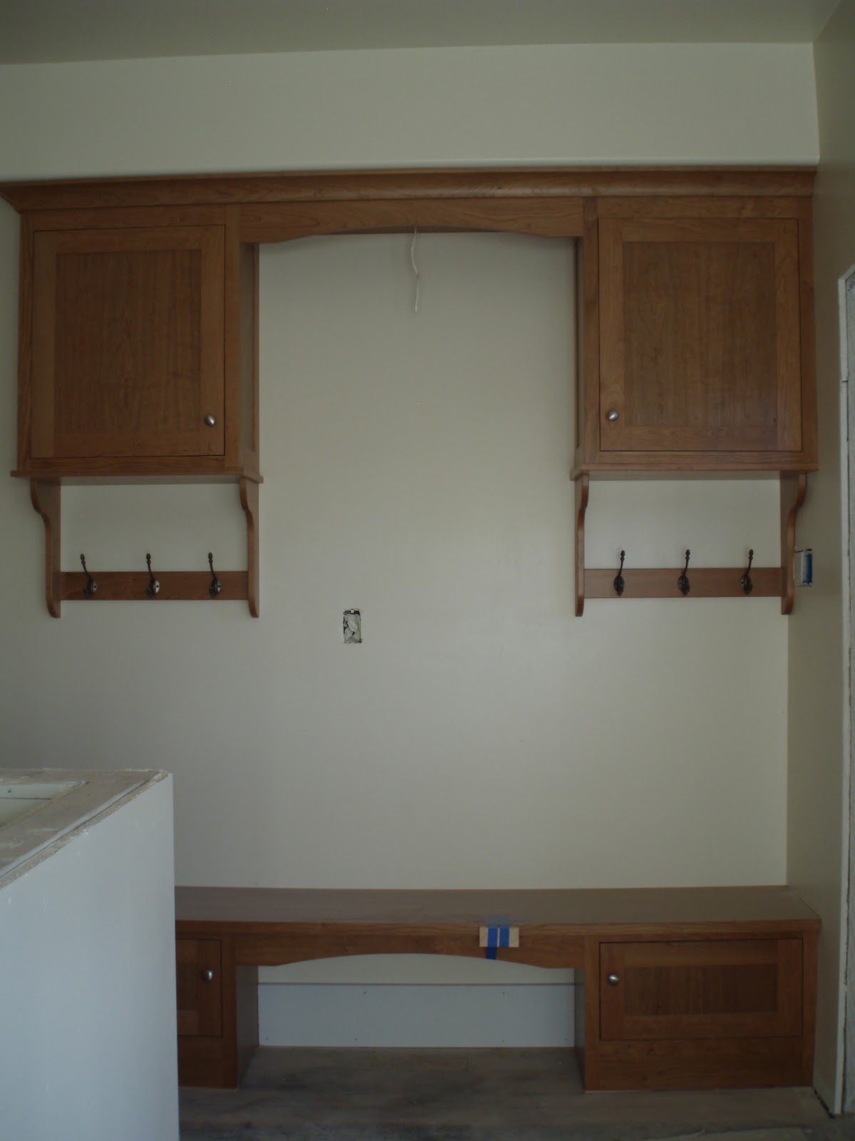
  The mudroom bench and cabinets are new.  This practical set of built-in furniture was made by Loughridge Cabinets in Scotts Valley.  When you walk into the mudroom/kitchen area from the side door you can park your groceries on the bench, hang your hat and coat on the hook, and sit on the bench to take your shoes off.

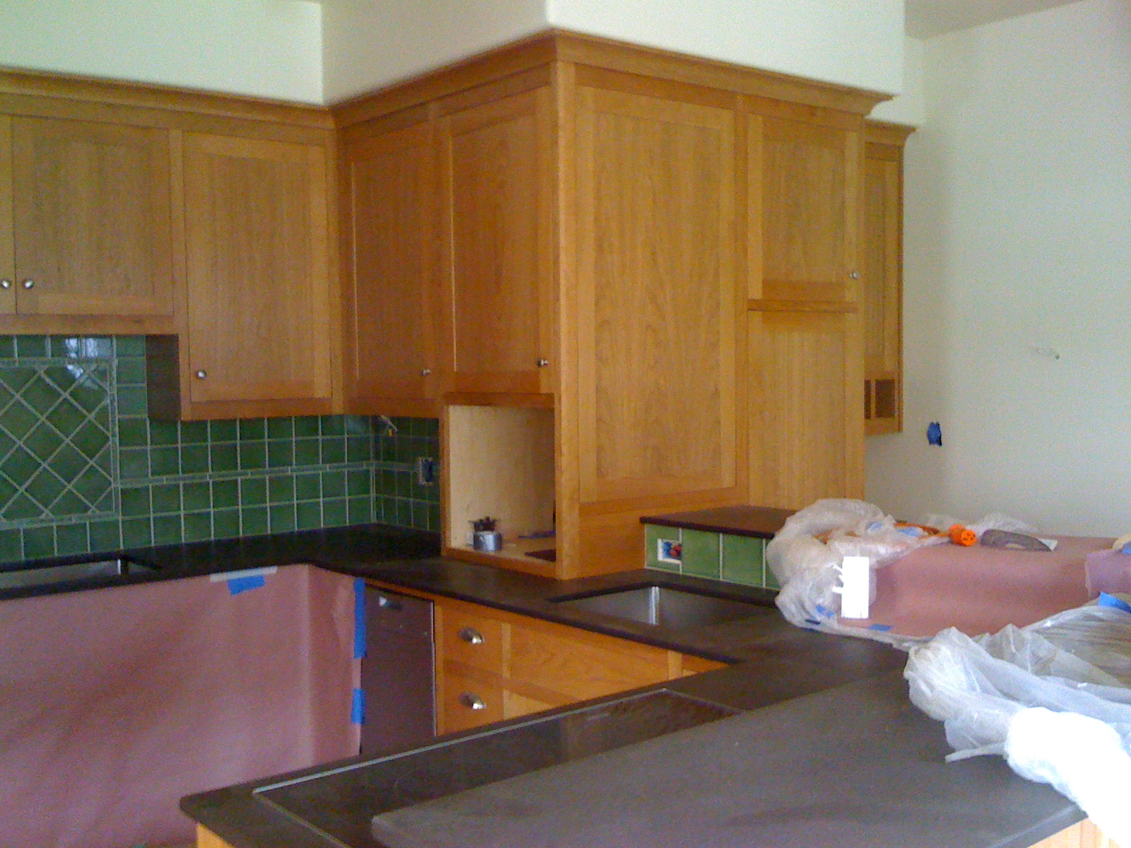
Speaking of the mudroom, we did use a piece of the old mudroom in our new kitchen.  The breadboard on the wall was re-used on the breakfast bar in the kitchen.


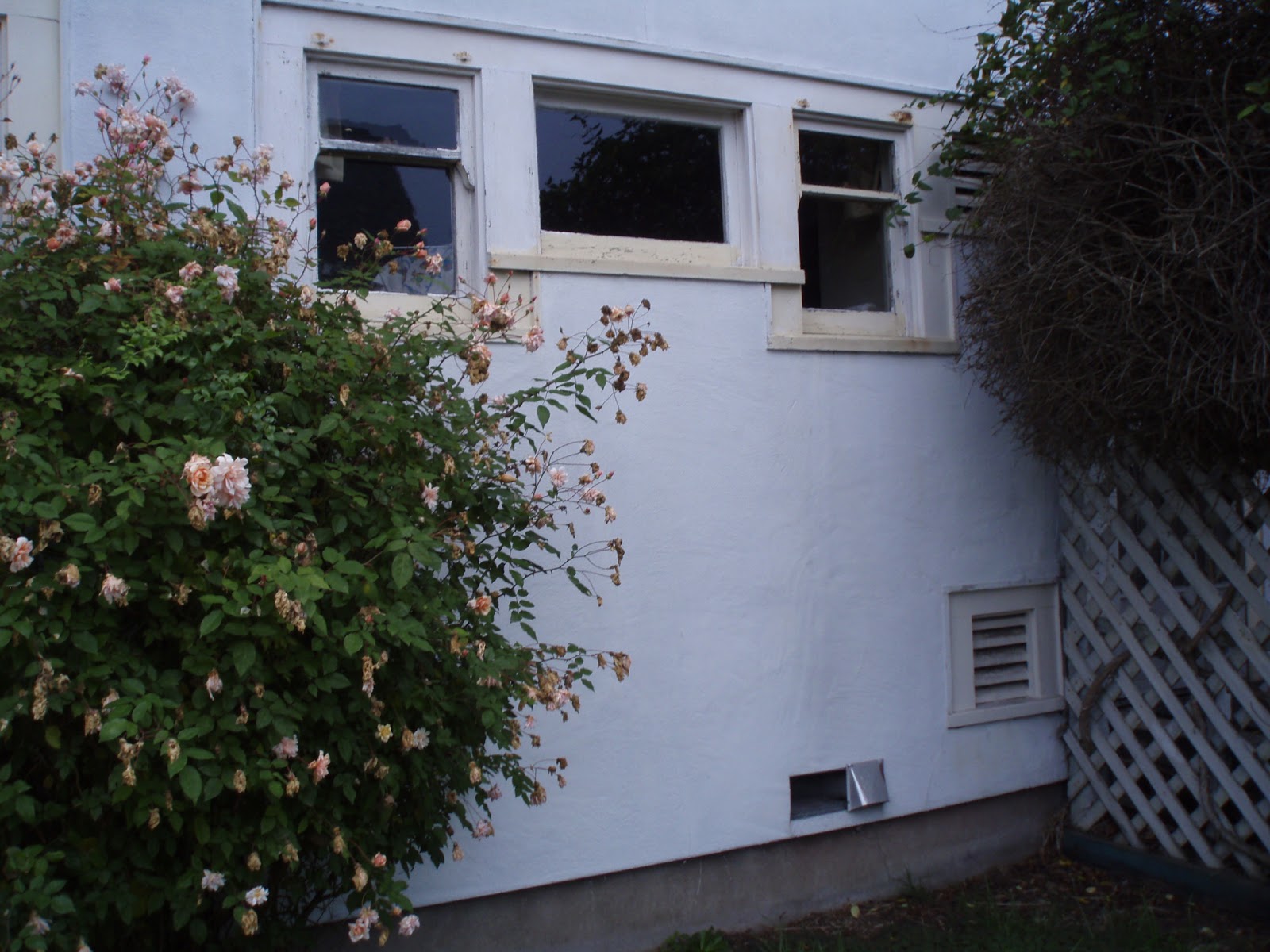
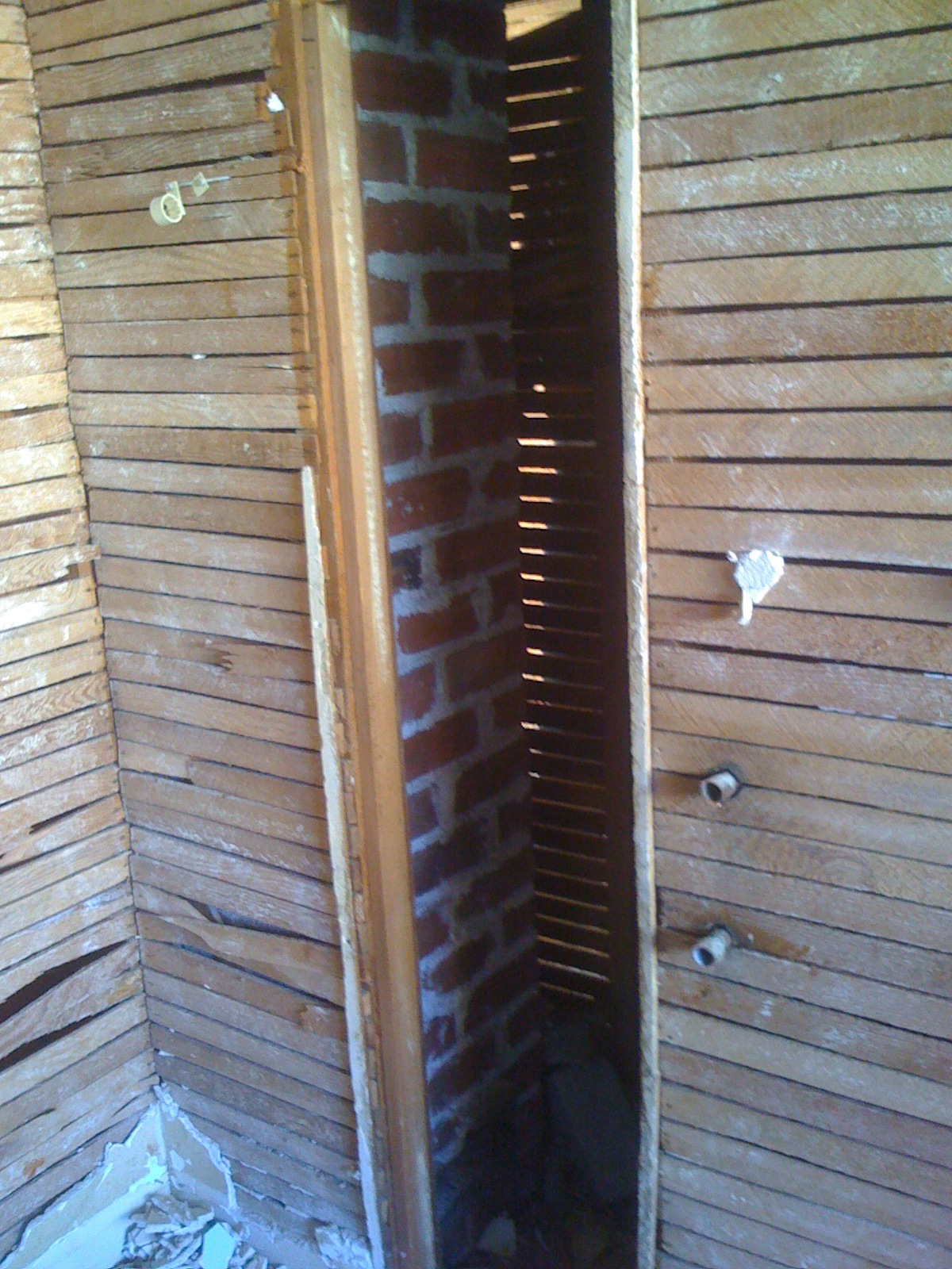
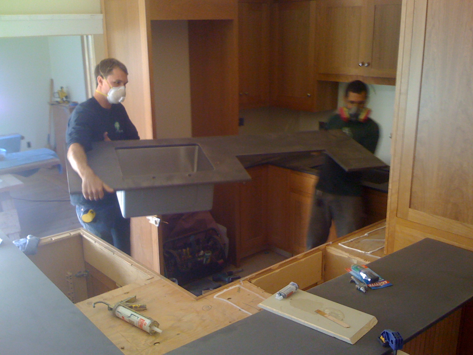
In our old kitchen the gas water heater was next to the stove, strapped onto the wall.  The gas stove and the water heater shared a flue going up through the ceiling to exhaust above the roof.


As you enter the front door you’ll see this tidy shoes storage to your right.  We ask all visitors to take their shoes off in our house and this is one of the places where you can store them.


Also made by Loughridge Cabinets, the concept of the Japanese “getabako” is expressed in the arts and crafts style.This is built back into the wall and protrudes through the dining room. In the dining room the back side of the shoes storage cabinet looks like a nice stand.

 The buffet is the original built-in furniture that stayed in place during construction.  It was covered up for 13 months while the crew worked around it.

French door between the dining room and kitchen is also original piece of the house.

 Finally, I added a touch of Japanese influence in this arts and crafts house by re-using my other’s old kimono as cushion covers.

Kitchen and Mudroom

December 14, 2012

We kept the same total footprint of the house — interior usable space of 1,569 square feet.  The room layout stayed the same, with the exception of the kitchen where we knocked down the wall between the kitchen and the mudroom and took the space from the bedroom closet.

Old layout

The original house had an exterior door into the mudroom that held the washer and dryer.  The kitchen had 3 openings.  One opening between the kitchen and the mudroom, a door leading to the hallway and another door into the dining room.  The sink faced the west windows and at the left end of the countertop was the ventilated vegetable storage (aka California Cooler) where the exterior wall had vents.  The gas-fired water heater was in the south-east corner next to the gas stove and range.   A ceiling fan vented to the outside could be operated by pulling the chain.  The north wall had a cute built-in cabinet.

The new layout

The new layout still has a mudroom, but there is no longer a wall separating the mudroom from the kitchen.  The door into the mudroom extends out to a small deck where we’ll have a outdoor gas barbecue.  A bench and cabinet is placed on the south wall and this is where we’ll hang out coats and take our shoes off.  Looking straight in from the mudroom door you’ll see a little desk area where we intend to do paper mail sorting, recipe lookup and such.  Pantry is next to the desk.  The breakfast bar wraps around the outside of the sink, countertop and cooktop.  There is no longer a door to the hallway and the cabinets cover the east wall.  We have 2 sinks in the hopes of having 2 cooks in the kitchen working side by side in peace.  The door to the dining room changed from the swinging type to a larger pocket door.

Here are some “before photos” of the original kitchen.


Mudroom:  As viewed from the kitchen.  Washer and dryer took up most of the space in the mudroom.  Note the bead board wall behind the washer and dryer.  Speaking of wall, the kitchen had the lovely funky plastic fake brick thing above the wainscoting.

Kitchen sink:  The kitchen sink and the countertop was a little taller than the standard countertop height I’m familiar with.  The windows above the sink and countertop provided pretty afternoon light.  On the right side of the sink is a vegetable storage space known as “California Cooler.”

California Cooler:  The upper and lower vents next to the lattice fence provided the cool breeze to flow through the wire mesh shelves to keep the fruits and vegetables fresh.  If you’re curious about the California Cooler, read what another blogger wrote about them.

Fridge, Stove, Water Heater:  The gas water heater in the kitchen was literally placed in the center of the house.  The seismic strapping prevented the use of the cool “ironing board feature,” (we think).  The gas stove/oven was a O’Keefe & Merritt from the 1950’s.  It was very cute but we didn’t want to have any gas combustion appliances in the house so it was sold on Craigslist.  The refrigerator was only about 5 years old and it too got sold on Craigslist.

Hidden Chimney:  When our designer took measurements of the house there was a small amount of unaccounted space between the closet and the kitchen.  This mystery was solved during the deconstruction where a chimney was revealed in the wall cavity behind the water heater.

Upper Cabinets:  A cute glass door showed what was stored in the cabinets.

Lower Drawers and Bins:  Below the upper cabinet was a countertop covered in blue linoleum.  These bins in the kitchen must have been used to store flour or some grains back in 1920’s.  As charming as these were we chose not to keep them.

Here are the “work-in-progress photos” of the new kitchen:

Mudroom Bench and Cabinets:  The door to the mudroom is to the right of the bench and we’ll probably use this door 90% of the time.  So, we’ll come in through the door and kick off our shoes then place them under the bench.  Next hang the jacket on the hook.  If we were riding our bikes and we had helmets and gloves they may go in the upper cabinet.

Desk and Communication Center:  The little desk in the corner of the mudroom will be used for day-to-day household paper and communication.  The slots above the desk will be used to sort mail.  Under the desk will have network devices and the desk will have a small computer that will display the house monitoring data (energy consumption, temperature and humidity).  To the left of the desk is the pantry.

Pantry:  Next to the desk is the pantry with pull-out drawers.

Upper Cabinets:  The kitchen cabinets are made of cherry wood in Shaker style with soft-close mechanism for doors and drawers.  Crown moulding a the top that bridge gaps between the cabinet and the soffit adds just the right touch to make the kitchen have the arts and crafts feel without being too fussy.  Loughridge Cabinets of Scotts Valley made these and we’re really happy with their workmanship.

 Countertop:  In these two photos you’ll see Taylor applying adhesive to the top of the cabinet then fitting the carefully cut PaperStone countertop with Jacob’s help. We looked at various materials for the countertop and the breakfast bar.  Going to a retail shop where you can see green product samples as well as get information from knowledgeable staff made a big difference.  We shopped for the countertops and breakfast bar in the spring of 2011 by going to Ecohaus in San Francisco (now closed) and GreenSpace in Santa Cruz (still open!!) and looked at many different green countertop products.


There are many different types of materials and color choices within each product line.  If you’re considering the pros and cons of different materials I invite you to take a look at the Countertop page of Green Remodel Forum where there is a detailed description of various materials by attributes.  Our selection criteria came down to 2 key points:  sustainability of the material and aesthetic fit with the California Bungalow style.  We chose a product called PaperStone in mocha color for the countertop.  It’s a sensible product that is made with FSC certified post consumer paper product held together with petroleum-free resin.  Details of the PaperStone material can be found here.

Tile:  For the kitchen backsplash we used the Debris series from Fireclay Tile which is made with 60% recycled material in the Bay Area.  While many distributors carry Fireclay tile we liked visiting the showroom in San Jose.  Picking out a dozen different sample tiles and taking it back to our kitchen to see which best matched the color scheme was very helpful.

Re-using the bead boards:  Remember the bead boards on the wall of the original mudroom?  They were re-used to surface the breakfast bar.

Appliances and Kitchen Design

December 6, 2010

One of the things we learned on Friday was that appliances consume the largest portion of the electrical usage in large homes.  The pie chart based on “PG&E Survey 2009” showed that appliances consume 28%, pool 24%, HVAC (heating and cooling) 16%, lighting 15%, electronics 9% and miscellaneous 8%.  Well, we don’t have a large home, we don’t have a pool and our passive house design will greatly reduce heating needs.  Still, getting energy efficient appliances is a priority for us since we do need new appliances and the energy efficient ones have various rebates and tax credits. 

Another thing that I learned (that Kurt already knew) was that 2/3 of electricity generation in U.S. is wasted.  Of the 40.67 quadrillion BTU energy consumed to generate electricity only 13.21 quadrillion BTU, or 32%, is delivered for end use.  Again, this means 68% is wasted.  Isn’t it amazing?   This source is from U.S. Electricity Generation 2008 chart from Energy Information Administration’s Annual Energy Review 2008.  These charts were part of the workbook material used in the “Integrating Energy Efficiency and Renewables in Home Retrofits” class offered by PG&E.  Another free class offered to the public by PG&E.  To search through their class offering please visit here.

So combining these 2 pieces of information we conclude that paying attention to the energy performance of our home appliances will not only save us money on our utility bill it also can lower our carbon footprint by reducing the demand on energy generation.  Saving money and saving the planet is a win-win formula.   

OK, so we will be replacing old appliances with energy efficient ones.  But which brand and model?

We started our appliance research by visiting the Miele Gallery in San Francisco.  Why Miele?  Because that’s what Flora recommended.  Our friend, Flora, is an artist that happens to be a terrific cook and has a beautiful kitchen.  She shared with us her experience of various home remodels (about 6 previous residences) she had done and one of the things she mentioned was to go to the kitchen gallery at the design center in San Francisco and take their classes.   

On Saturday we went to the kitchen design class at the Miele Gallery.  A nice light breakfast was served before the class and Kurt got to ask questions to his heart’s content as 3 presenters covered different topics.  First, Ruth did a nice job of covering the highlights of kitchen design.  Then Rebecca covered the details of Miele appliances.  (She opened our eyes to the steam oven!)  We will be taking the master chef class at Miele in a week to learn more about this and other appliances.  Then Maureen showed examples of tiles and countertops and went into details of the different countertop materials.  Again, this class was free!  

Later we went to an appliance store in San Francisco and learned about a showroom in Brisbane that displays and hold classes for other brands such as Sub-Zero, Wolf, Thermador and Bosch.  The search for appliances will continue….


>